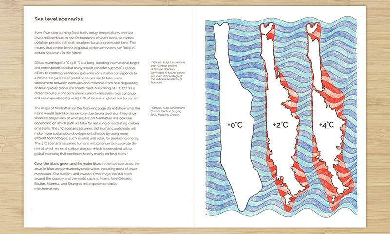
Sea level scenarios
Color what Manhattan would look like in different scenarios of global warming and sea level rise
Data sources
Strauss, Kulp, Levermann, Climate Central. Surging Seas, Mapping Choices. Accessed December 2016.
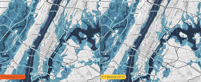
The maps used in this activity are based on peer-reviewed scientific research led by Benjamin Strauss and Scott Kulp of Climate Central in collaboration with Anders Levermann of the Potsdam Institute of Climate Impact Research, and published in Proceedings of the National Academy of Sciences of the United States of America. Application of this research to areas outside the U.S. is detailed in the Mapping Choices report.
The map of Manhattan is based primarily on high quality lidar bare earth elevation data curated by NOAA, with roughly 5-meter (16-foot) horizontal resolution and a vertical accuracy (root mean square error) generally within 15 centimeters (6 inches). They also reference local high tide lines (mean higher high water, MHHW) based on high-resolution tidal modeling from NOAA, via the tool VDatum.
How the data was used
The maps of projected sea level lock-in for 2 °C and 4 °C warming scenarios were translated from the research and maps from the Climate Central website.
Code
A python script is available in the code repository to generate or extend this activity, and can be run like this:
python slr.py
Which will simply create an svg file that traces the maps of Manhattan that were translated from the Climate Central website where blue is considered water and white is considered land.