Examples of coloring activities
Color where carbon emissions from fossil fuels are the greatest, which looks similar to a population density map since this type of greenhouse gas is caused by human activity.
See if you can color 20 football fields in under a minute, which is about how fast we have been losing global forests for the past 25 years.
Trace what Arctic sea ice looked like 20 years ago and color in what was lost since then. The difference is about the size of India.
Color a year of air pollution in Beijing and see how it affects the health of the local population of over 21 million.
Book details
- 40 pages with over 20 coloring activities accompanied by written descriptions of the research and sources
- Coloring activities include the causes and effects of climate change as well as solutions to reduce climate change
- Printed by a local eco-friendly printing company
- Heavy, high-quality, 100% recycled paper
- Vegetable-based, non-toxic ink
- 8.5 x 11 inches
- More book details
Kickstarter
This book is made possible by backers on Kickstarter who contributed over $24K in May 2017. Keep up-to-date on my public status updates on the Kickstarter page. You can now order the book online.
Press
- Artist turns climate science into a coloring book via Yale Climate Connections
- For Your Next Adult Coloring Book, Shade In Data On Climate Change via Fast Company
- Stress yourself out with this coloring book about climate change via The Verge
- Color Your Way Through Air Pollution With a Climate Change Coloring Book via Mental Floss
- Color Your Way to Climate Reality via Last Word On Nothing
- All-ages coloring book communicates the science behind climate change via Treehugger
- Climate Change Coloring Book via FlowingData
Why a climate change?
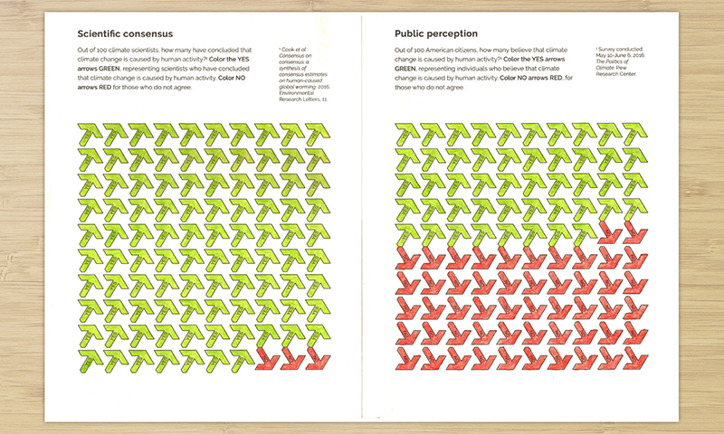
Climate change is one of the most significant issues that uniquely affects everyone around the globe. There currently is a significantly large gap between scientific consensus and public perception of climate change. Since public perception influences government and business policies around environmental issues, it is important to ensure enough unbiased and reliable information about the issues are available to the public.
This book is not political, but a celebration of information, learning, and research.

Sample page: Comparing scientific consensus and public perception on man-made climate change
Why a coloring book?
The act of coloring is slow. A coloring book has a meditative quality. A chart or article about climate change may be good at delivering information quickly. But with a coloring book, there is more time to absorb the information and reflect upon on the underlying issues.

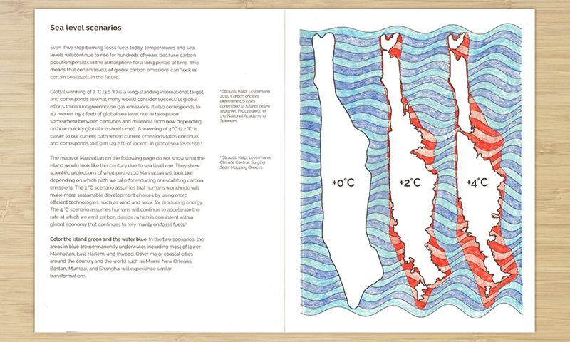
Sample page: What Manhattan would look like in different scenarios of global warming and sea level rise
The data, research, and approach
This book only uses data and research from authoritative sources, and are heavily cited in the book and through documentation on this website. A sampling of prominent sources in this book:
- National Oceanic and Atmospheric Administration (NOAA)
- National Aeronautics and Space Administration (NASA)
- United States Environmental Protection Agency (EPA)
- National Snow and Ice Data Center (NSIDC)
- Energy Information Administration (EIA)
- National Renewable Energy Laboratory (NREL)
- Food and Agriculture Organization of the United Nations (FAO)
My processes for using data and research to create the activities in this book are 100% transparent and documented in detail. Furthermore, the code used to generated the art in the book is also freely available to use and extend.

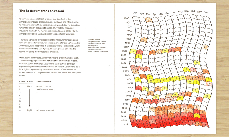
Sample page: The hottest of each month on record for the past 137 years
About the author
Brian Foo is a data artist and computer scientist living and working in NYC. He is interested in the intersections of art, science, and education. He is a data visualization artist at the American Museum of Natural History working on public exhibits related to climate change. This book is entirely his own and not affilliated with the museum.
His recent work, Data-Driven DJ, has been featured on NPR, Information is Beautiful Awards, The Washington Post, and The Atlantic. His data and design work at the New York Public Library Labs has been featured on WNYC, The Washington Post, and The New York Times.
You can contact him at hello@brianfoo.com.
About the editor
Allyza Lustig is a climate change adaptation specialist and science communicator living in New York City. She has worn various hats within the US Global Change Research Program, NOAA, Columbia University’s Earth Institute, and the Urban Ecology and Design Laboratory at Yale University.