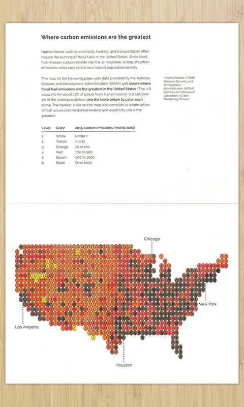
Where carbon emissions are the greatest
Color where carbon emissions from fossil fuels are the greatest in the United States
Data sources
CarbonTracker CT2016. National Oceanic and Atmospheric Administration (NOAA), Earth System Research Laboratory, Global Monitoring Division.
The file CT2015.flux1x1.longterm.nc (NetCDF format) was taken from the monthly data files, accessed December 2016. This file contains:
- Fossil fuel CO2 exchange (flux) of each 1x1 degree lat/lng area of the world
- Measurements are given in moles per square meter per second
How the data was used
- Measurements are converted from moles per square meter per second to metric tons per square kilometer per year
- Second to years:
(mol m-1 s-1) x 3600 x 24 x 365.25 = (mol m-1 y-1) - Mols to grams:
(mol m-1 y-1) x 44.009 = (g m-1 y-1) - Meters to kilometers:
(g m-1 y-1) x 1,000,000 = (g km-1 y-1) - Grams to metric tons:
(g km-1 y-1) / 1,000,000 = (t km-1 y-1)
- Second to years:
- The data is reduced to only include 1x1 degree areas contained in the contiguous United States
- Each measurement is categorized into one of six groups/colors based on it’s value
Code
Python scripts is available in the code repository to generate or extend this activity. First you need to convert the .nc files to .csv files. You only need to do this if you downloaded a new .nc file. This has already been done for the 2015 file.
python nc2csv.py
Then you can then run this script to generate a map in .svg format:
python flux.py
By default, it will display the contiguous United States map with labels on each 1x1 degree area based on fossil fuel CO2 emissions. But you can pass in any .geojson file and it will generate a map using just the coordinates in that file. For example, you can generate a map of China like this:
python flux.py -geo data/CHN.geo.json